FareShare Mobile App
FareShare provides a carpooling mobile platform for drivers and riders to connect. FareShare sets itself apart from other rideshare apps through an algorithm that matches users based on mutual interests and personalities. They reached out to our team to design a user-friendly mobile app.
Role
Product Designer
Team
3 Product Designers
Duration
3-week sprint
Platform
Mobile
PROBLEM
One of the guiding motivations for FareShare was to increase the carpooling culture in cities like Los Angeles. However, users expressed concerns around compatibility, safety, and scheduling logistics.
SOLUTION
We designed a comprehensive onboarding process that addressed user concerns around compatibility and safety. Additionally, we created a seamless process for users to manage their weekly schedule to address concerns around scheduling logistics.
Discover
UNDERSTANDING THE VISION
Upon sitting down with our stakeholders, our team learned that FareShare’s key differentiating feature is an algorithm that matches commuters by personality. The stakeholders furthermore emphasized the importance of incorporating that feature in our design.
UNDERSTANDING THE USERS’ BEHAVIOR
We designed a customer survey aimed at quantifying people’s carpooling behaviors. We asked 46 users (all LA residents) to check 5 criteria they valued the most in being matched with other carpoolers.
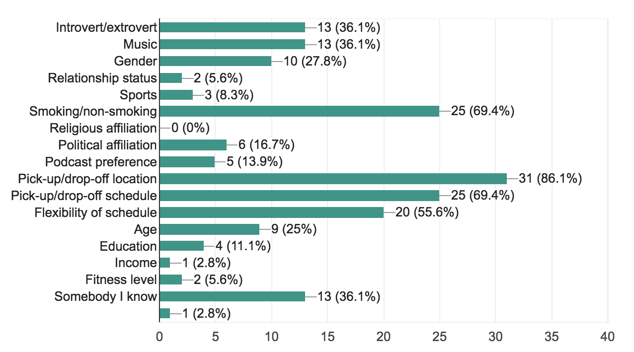
The results to this question were among the most telling of our entire survey. Outside of the obvious logistical preferences (e.g., pick-up/drop-off location and schedule), the top 5 criteria that people chose were:
- Smoking/non-smoking
- Introvert/extrovert
- Music
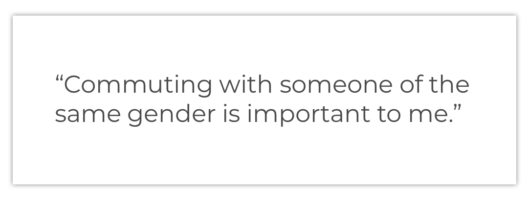
- Gender
- Age
These 5 criteria became key drivers in our design of the onboarding process.
LISTENING TO THE USERS
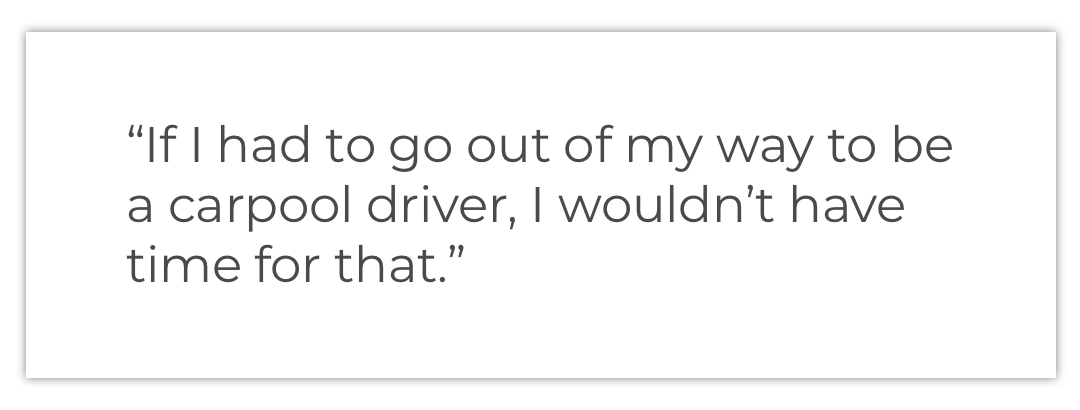
We also conducted 9 user interviews with rideshare drivers (e.g., Uber drivers), rideshare passengers (e.g., Uber riders), carpoolers, and people waitlisted to join FareShare. We wanted to hear users’ experiences, pain points, and motivations for carpooling.
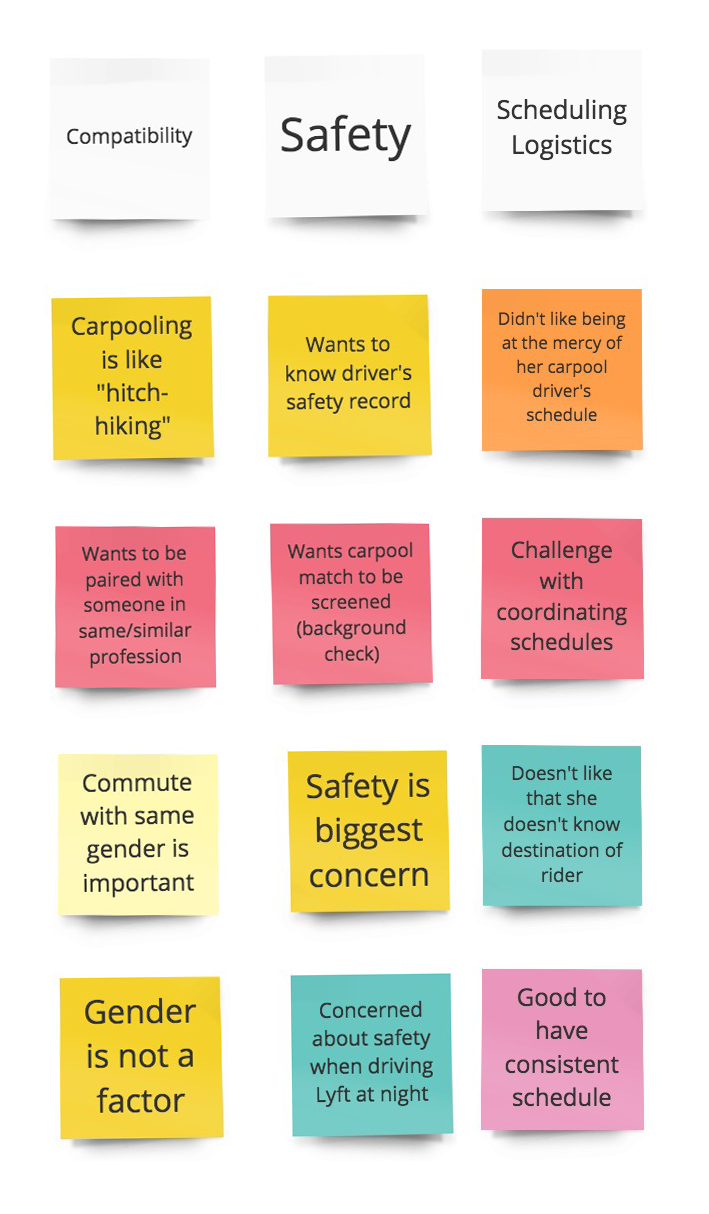
DISCOVERING PATTERNS IN OUR USERS' RESPONSES
From the interviews, we identified over 30 ideas and concerns relating to carpooling, each represented by a post-it note. Through affinity mapping, we created logical groupings to identify themes, ultimately 9 distinct categories. The categories that stood out were related to safety, scheduling logistics, and compatibility—thus validating FareShare’s belief in personalization. We used these three categories as primary motivators to design around, and referred to them as the “Core Concerns”.
TRYING OUT CARPOOLING
Wanting to get first-hand experience using a carpooling app, I signed up to be a rider on one of FareShare's competitor apps: Waze carpool.
The process of finding a driver on Waze Carpool was relatively seamless, so I had suggested that our team revisit Waze Carpool during ideation. However, I also experienced the following pain points:
- Difficulty finding my driver because her car information was not in the app
- Issue of safety knowing that she was not required to do a background check
These pain points were areas that needed to be addressed in our design.
FINDING INSPIRATION IN UNEXPECTED PLACES
However, noticing that none of the existing rideshare and carpooling apps offered a matching feature, we turned to dating apps, focusing on their onboarding questions related to finding the perfect match. Whereas rideshare apps asked for only billing information, dating apps spent the time to understand their users’ preferences and personalities. Our challenge was marrying the logistics of a rideshare app with the interpersonal features of a dating app.

Ideate & Design
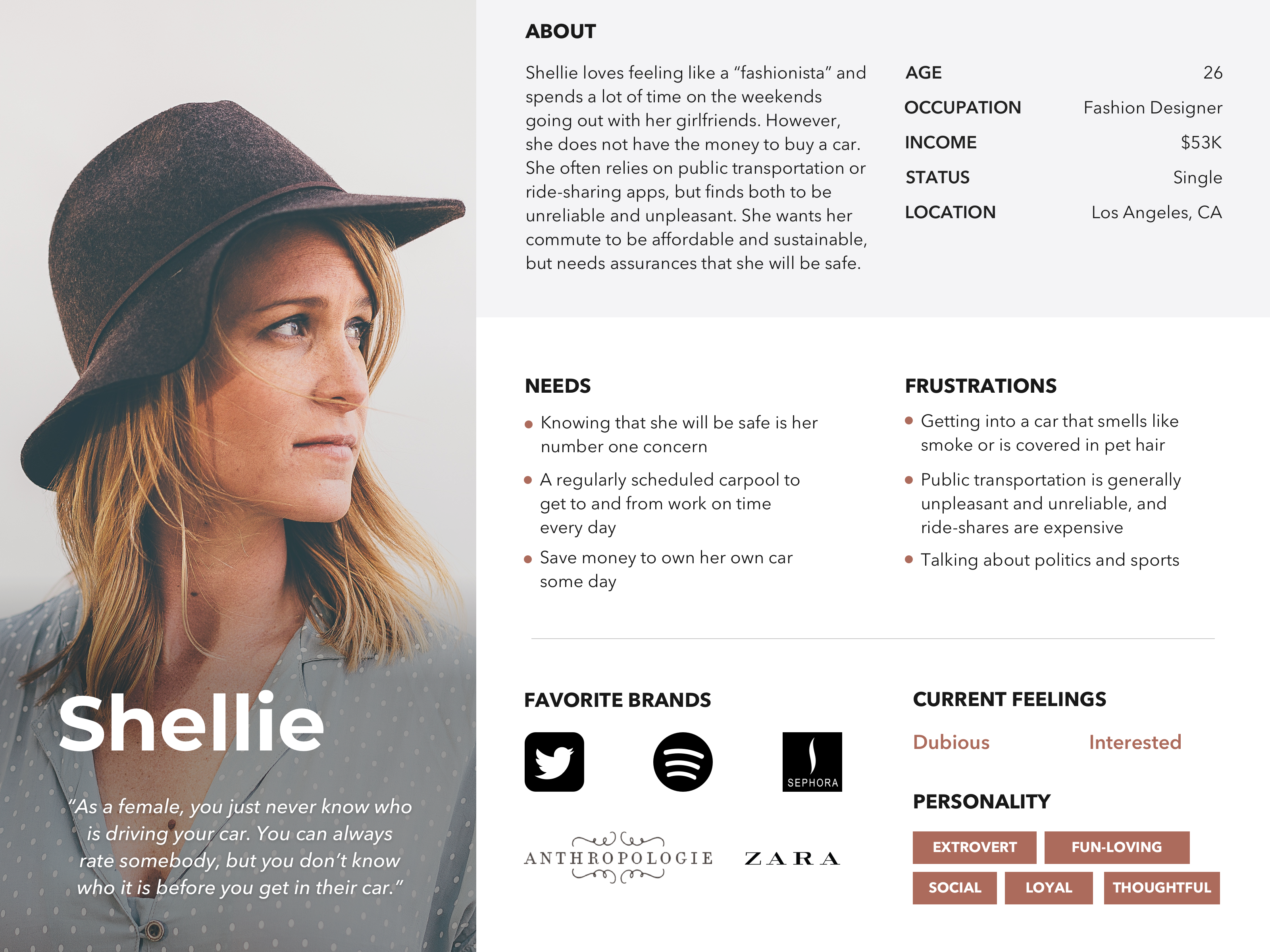
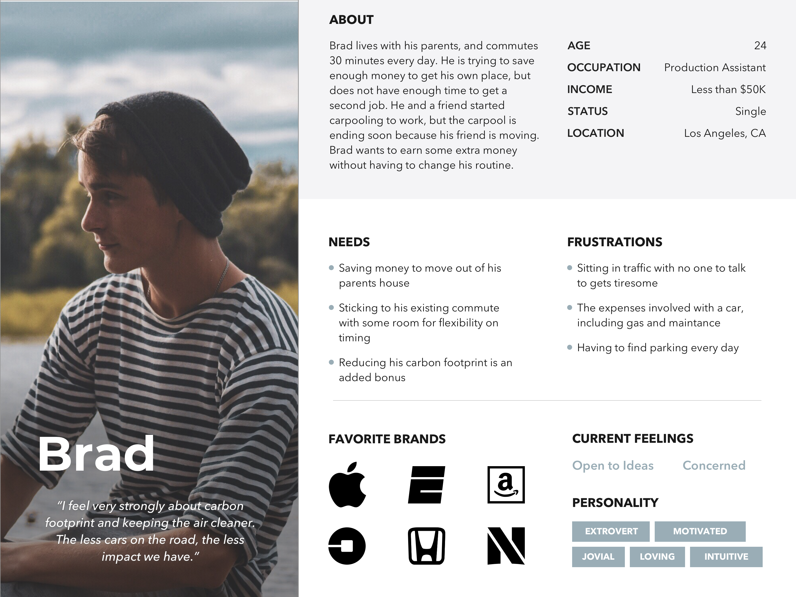
DEVELOPING OUR PERSONAS
Drawing from our research findings, my team member developed two personas—one to represent the rider and another to represent the driver.
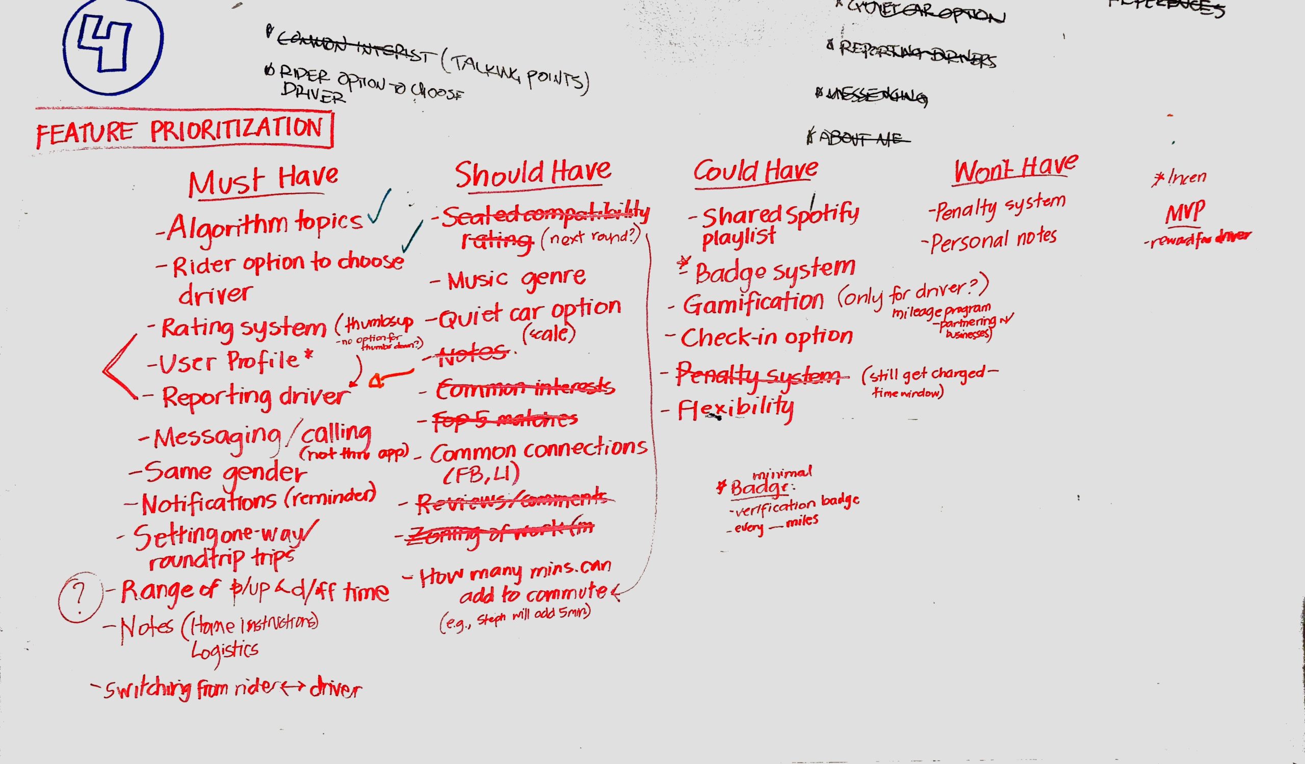
IDEATING ON FEATURES
Now that we had identified the Core Concerns, we needed to address them. We listed various features that the app could include, and grouped these features according to their level of importance in producing the minimum viable product. To refine our conclusions, we collaborated with our stakeholders to ensure that the grouping would align with their business goals. After much back-and-forth, we settled on features that the app “must have”, “should have”, “could have”, and “won’t have”.
CONNECTING THE FEATURES TOGETHER
The bulk of our work was in designing and iterating on the driver and rider flows. The challenge was striking a balance between making the onboarding process seamless yet comprehensive enough where the algorithm would have enough data to make accurate matches.
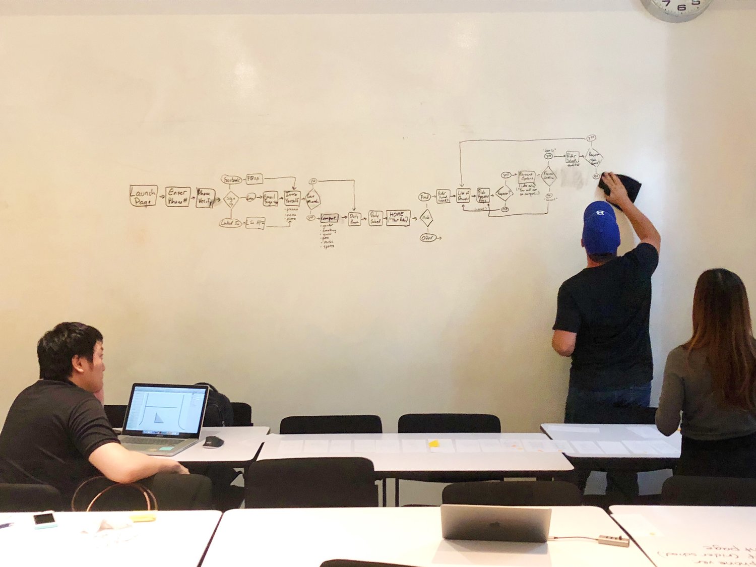
Thinking we had our flows solidified, my team member started designing the initial wireframe sketches. However, as we laid out the sketches and went through each step of the flow, we realized that several pages were still missing. We literally had to go back to the drawing board, and hash out each step in the flow.
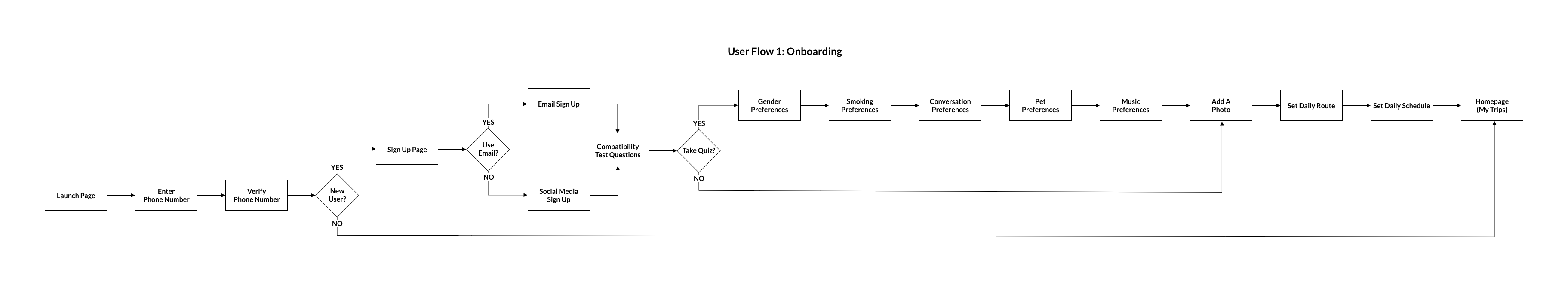
Onboarding user flow
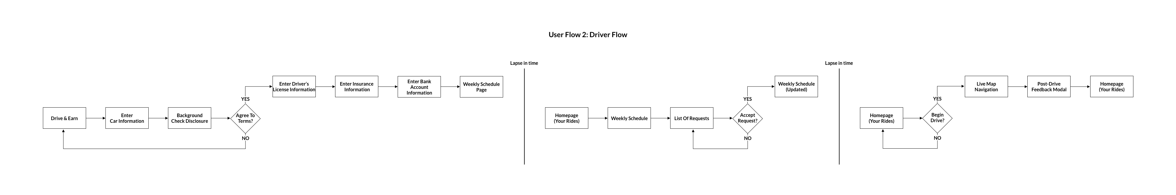
Driver user flow
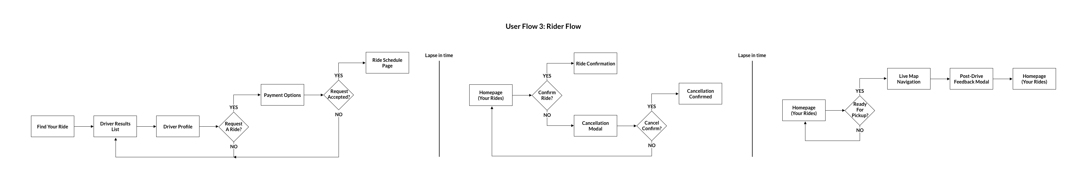
Rider user flow
WIREFRAMING THE FLOWS
With the final user flows in place, I took the lead in designing the medium-fidelity wireframes, which in number totaled to 60 due to the complexity of the flows and the vision of our stakeholders.
Test & Iterate
PUTTING THE PROTOTYPE IN THE USERS' HANDS
We needed to test the app immediately in order to get user feedback. We conducted a total of 8 usability tests—3 on the medium-fidelity prototype, and 5 on the high-fidelity prototype. Based on our observations and user feedback, we iterated on our design.

I summarized the usability test results in a comprehensive report, through which our stakeholders could have a digestible summary of our findings.
THE END RESULT
I took the lead in designing the high-fidelity wireframes, which incorporated the color palette that the stakeholders had requested.
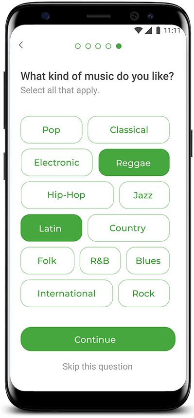
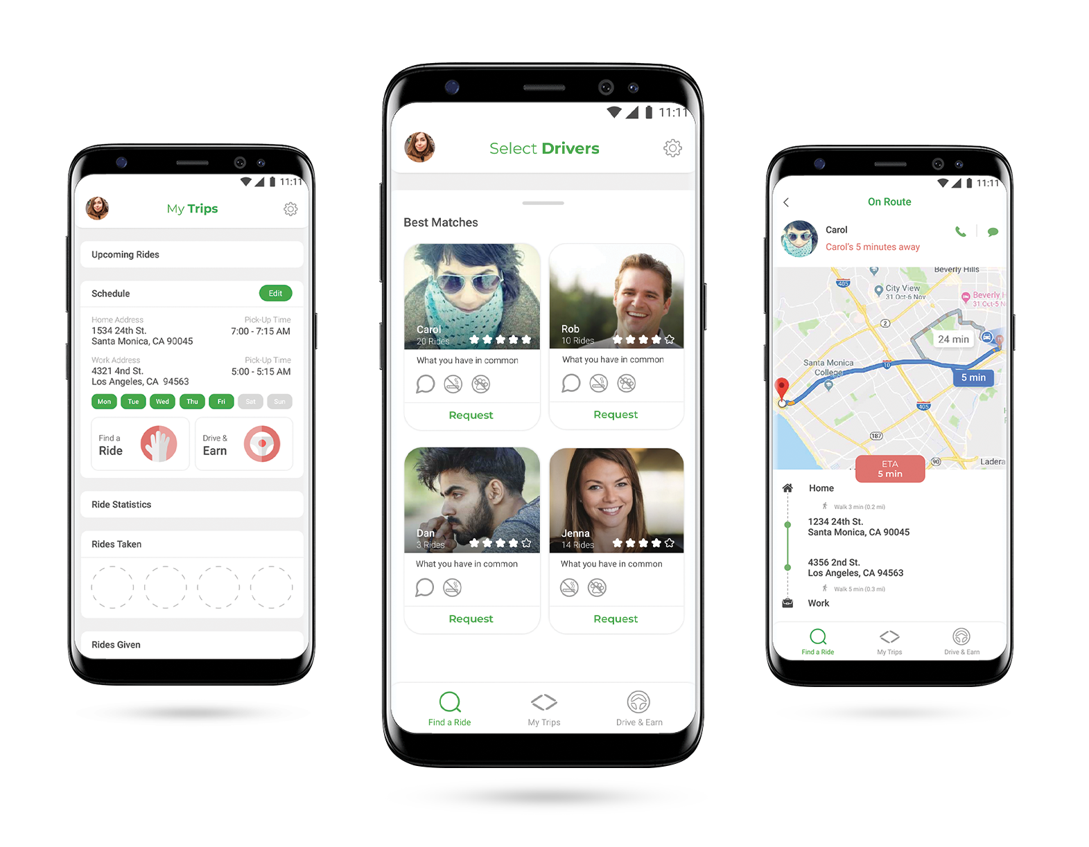
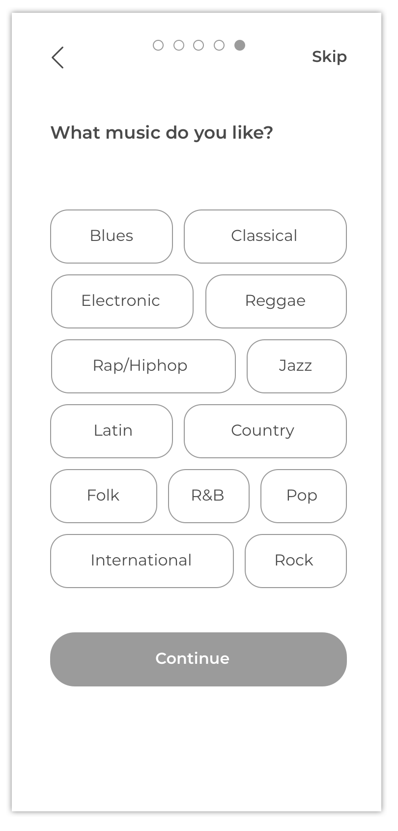
Onboarding
The onboarding includes the compatibility flow, which gives the user the option to skip and return to later.
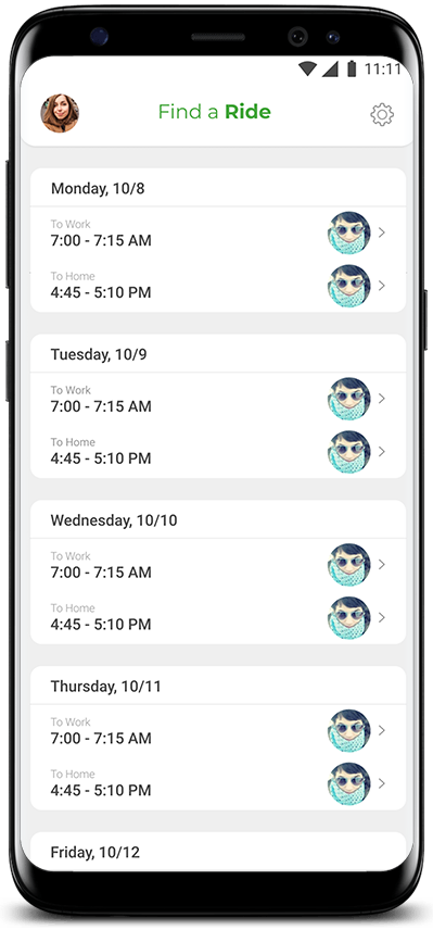
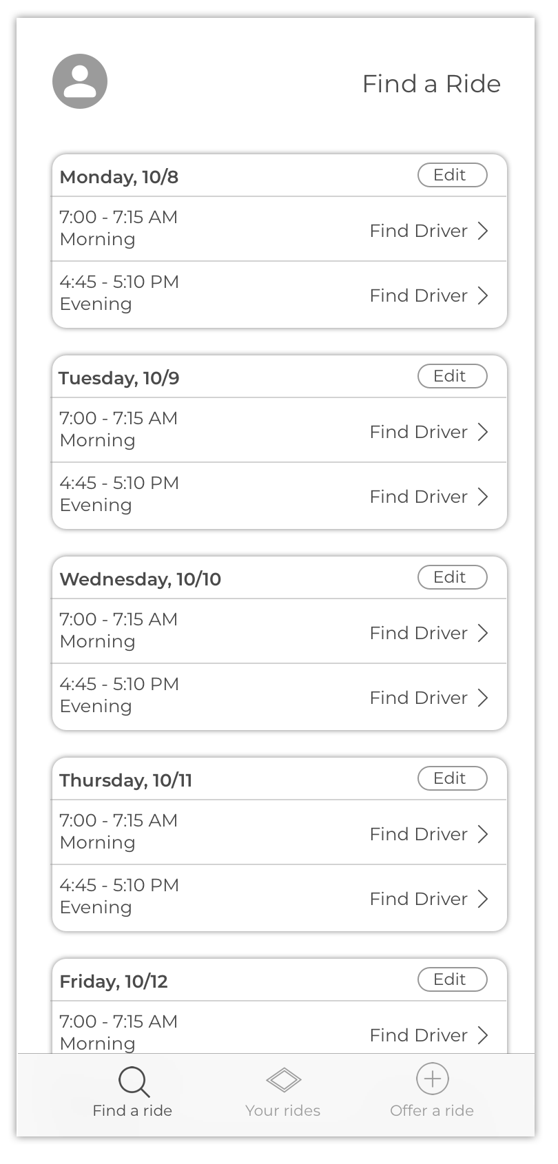
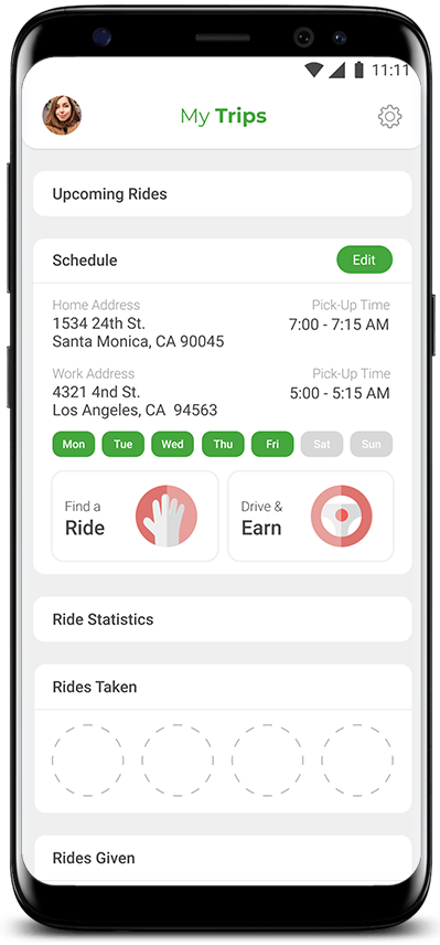
Homepage
The user is able to toggle between being a rider and a driver, and can view their schedule at a glance.
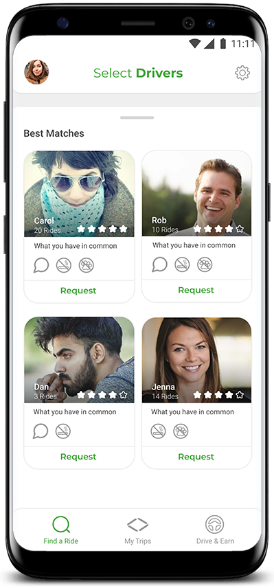
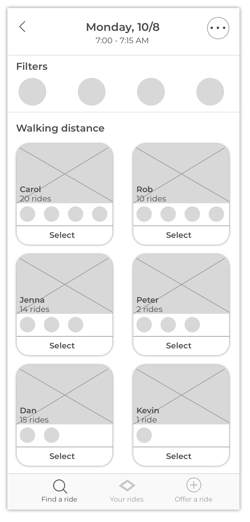
Driver Results Page
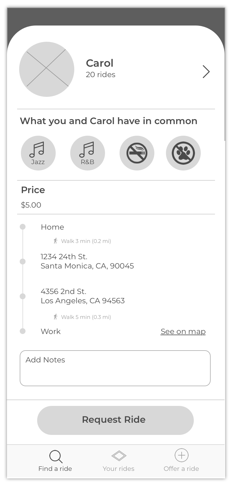
The rider is presented with a list of drivers who match them based on schedule and personality.
Weekly Schedule Page
The rider has the ability to edit each day of the week in case of schedule changes.