Uber Driver Education
A cornerstone for Uber’s high quality of service is training Uber’s driver and delivery partners—the people its customers actually interact with. Therefore, it’s important that these partners have the right amount of guidance, control, and understanding of how to be successful as a driver. We wanted to transform their old training resources, which were scattered, unorganized, and overwhelming, into a resource that would make onboarding seamless and convenient to them. That way, these partners can feel confident and successful from day one.
Role
Lead UX Designer, Information Architect
Team
HAUS' UX & UI Team, Uber's web team (content operations manager, regional web leads, UX copywriters)
Duration
2 months
Platform
Responsive web
PROBLEM
Uber’s partner training resource houses videos that are too generic to be useful for partners in different parts of the world. As a result, partners end up spending more time trying to find relevant information that’s scattered throughout the website rather than actually learning.
SOLUTION
Our solution was to get rid of the “treasure hunt” experience by consolidating all relevant information into 31 lessons that can be found in Uber’s training resource. This task required sifting through hundreds of web pages, identifying which information was pertinent, and creating a clean and focused information architecture. As a result, partners can now focus their energy on actually learning.
Discover
JUST THE TIP OF THE ICEBERG
I began by familiarizing myself with Uber’s current training resource called the “basics of driving with Uber”. It consisted of 8 chapters—4 for drivers and 4 for food delivery partners. However, each lesson only housed a generic video that had “global” information (i.e., information not specific to any singular geographic location or market). It was certainly lacking.
EXPLORING EVERYTHING ELSE
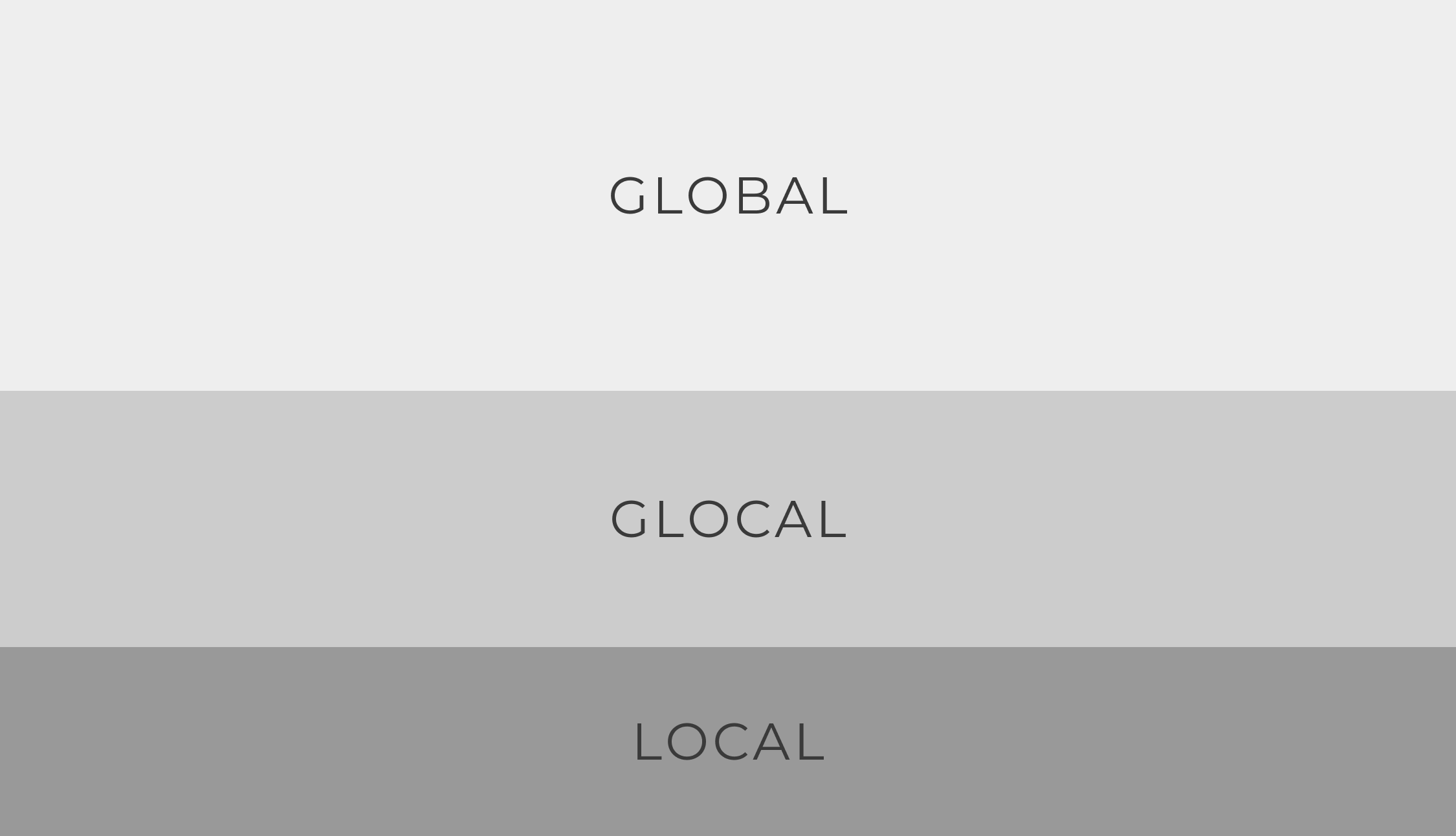
I then reviewed an Uber internal audit regarding hundreds of other partner resources scattered throughout their website. These resources were built by regional teams from Europe, the Middle East, and Africa (EMEA), Latin America, Asia Pacific (APAC), and India. The content fell into three categories:
DIGGING DEEPER
I dug deeper and visited many of these pages built by regional teams. The pages displayed more “glocal” and localized information specific to that region. However, unless partners had the specific URL to many of these pages, they would not be able to find them in the website. As a result, partners were left unaware of all the other resources hidden beneath the surface.
STRIKING A BALANCE
I laid out everything in front of me—from the global content to the glocal and local content found in hundreds of regional lessons throughout uber.com. I then crafted a problem statement to guide me moving forward:
The information that Uber partners need is scattered, difficult to locate, and ultimately constrains Uber’s ability to successfully train its partners. How might we strike a balance between providing partners access to all necessary information in one place while also not overwhelming them?
Ideate
EXPLORING THE INFORMATION ARCHITECTURE
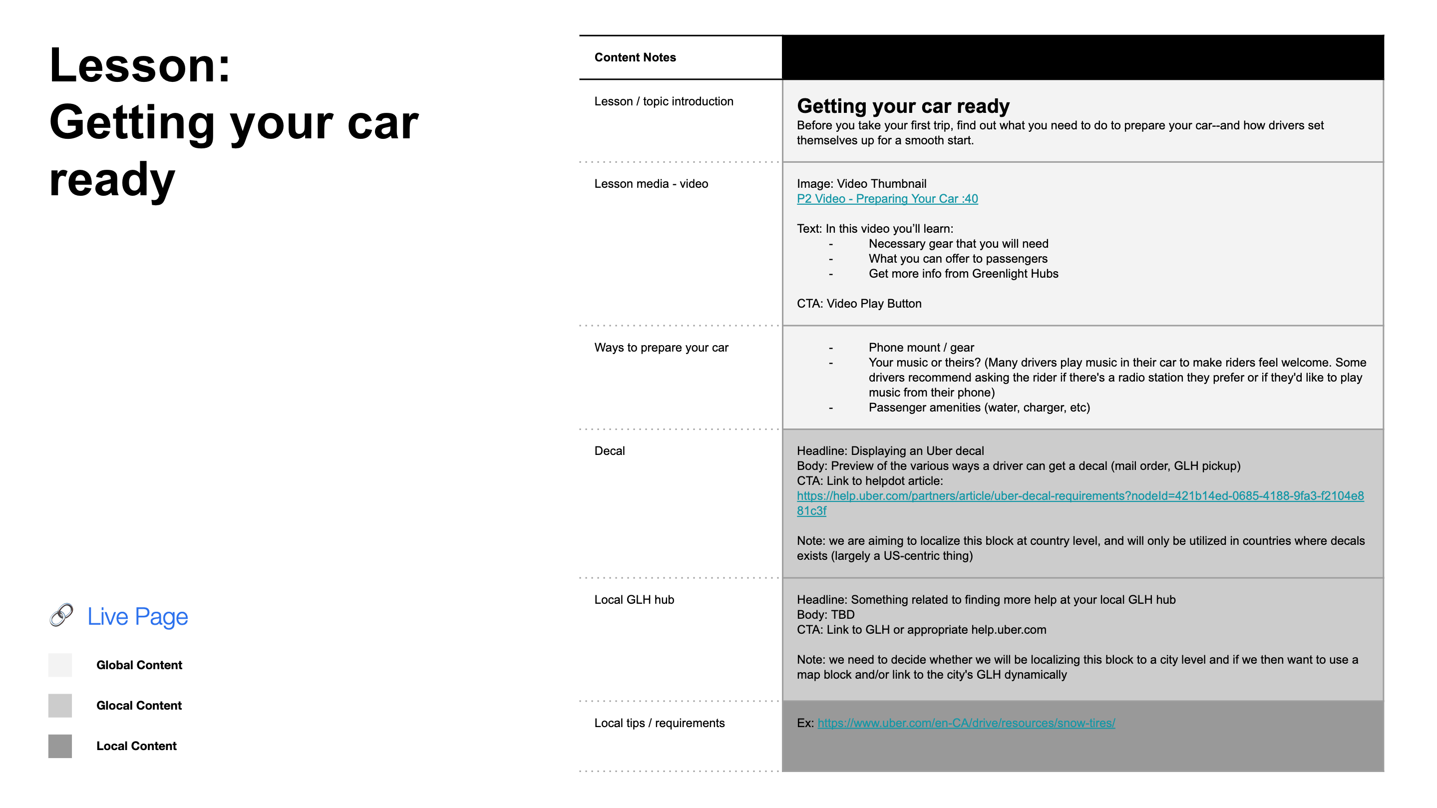
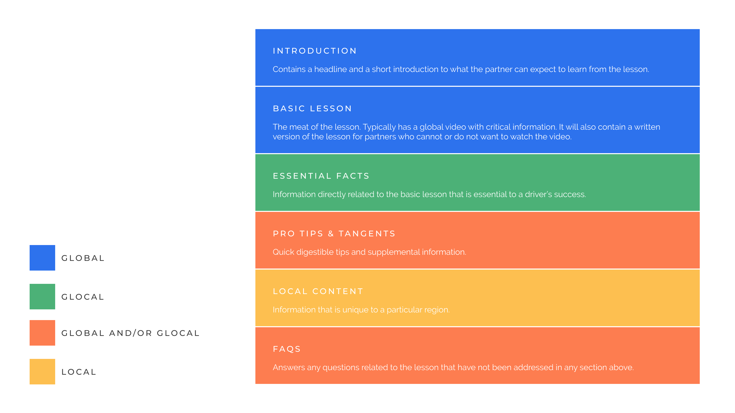
Our UX team used the 31 lesson topics found in the “basics of driving with Uber” as the skeleton for our work. We started each lesson with global content, followed by glocal content, then local content. We figured that separating out the three different types of content would make it easier for regional teams to edit/add information in the glocal and local sections. The page layout of the lesson would be as follows:
FILLING IN THE DETAILS
We organized these lessons into a series of priority guides—Uber’s preferred method for organizing the information architecture on a page. While a majority of the global information in each priority guide was taken from the “basics of driving with Uber” lesson (typically in the form of a video), the glocal and local information were more challenging to identify. Working in close collaboration with Uber’s content operations manager, our team referred back to the audit and hundreds of local pages to extract the relevant glocal and local information that would go with each lesson.
This phase proved to be one of the focal points of our project—as we had to decide what information was relevant, and what was not. Much like creating a syllabus, this required an intimate familiarity with the subject matter at hand.
NOTICING SOME ISSUES
Upon completing the first iteration of priority guides, we took the time to reflect on our structure. Our evaluation revealed a few things:
1. During our design journey, we had to reevaluate if our designs were meeting the needs of the actual drivers who use the lessons or if we were starting to overaccommodate the asks of the regional teams. We needed to strike a balance without compromising the experience of the actual end users.
2. We started seeing patterns with the information in each priority guide, which we were not capitalizing on.
3. Uber’s content team informed us of certain regional concerns regarding the videos in the global section. Namely, many regions have more localized, region-specific videos that they wanted to use in place of the global videos.
4. We were also informed that some regions are unable to play videos due to slower internet connection.
ADDRESSING THESE ISSUES
To address the above issues, we iterated on the priority guide’s structure:
1. We moved to a more partner-centered approach, focusing more on the hierarchy of information a partner needs rather than the global relevance of the information.
2. We agreed that each lesson would still start with the basics, which are global in nature. This typically includes a global video.
3. We introduced new sections (e.g., essential facts, pro tips) for each lesson based on the patterns we had identified. These would go below the global video.
4. These new sections include information that both summarizes and adds to the topics covered in the video. This ensures that regardless of whether the video is viewed or not, a partner is able to get all the information—global, glocal, and local—they need to work for Uber, thus addressing the aforementioned regional concerns.
5. For each lesson, we kept the local section blank in the priority guides. This section acts as a placeholder for any localized content a region might want to add to the lesson.
Design & Iterate
SERVING AS A PRIMARY CONTENT RESOURCE
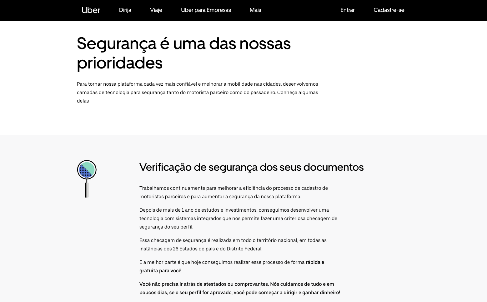
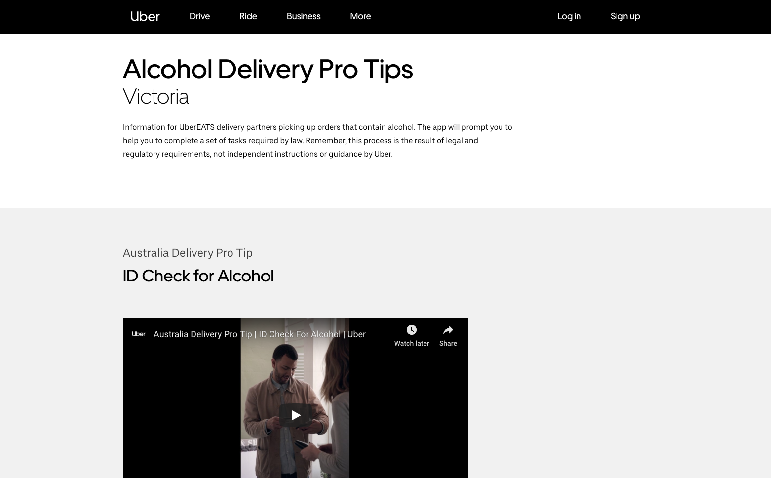
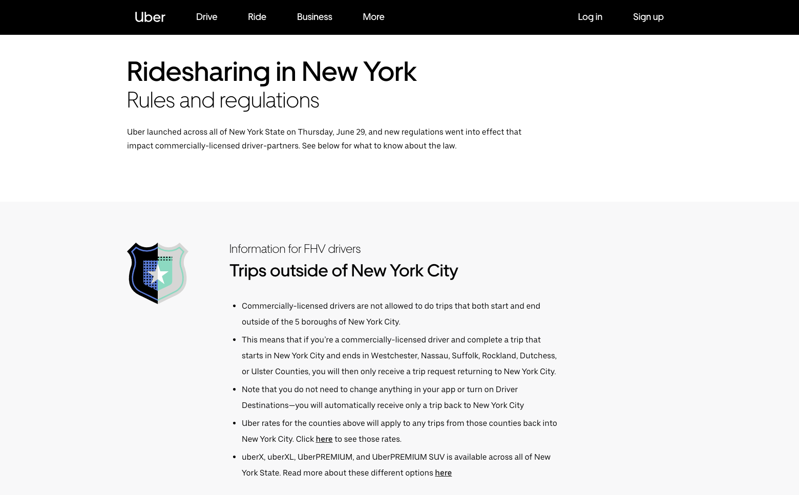
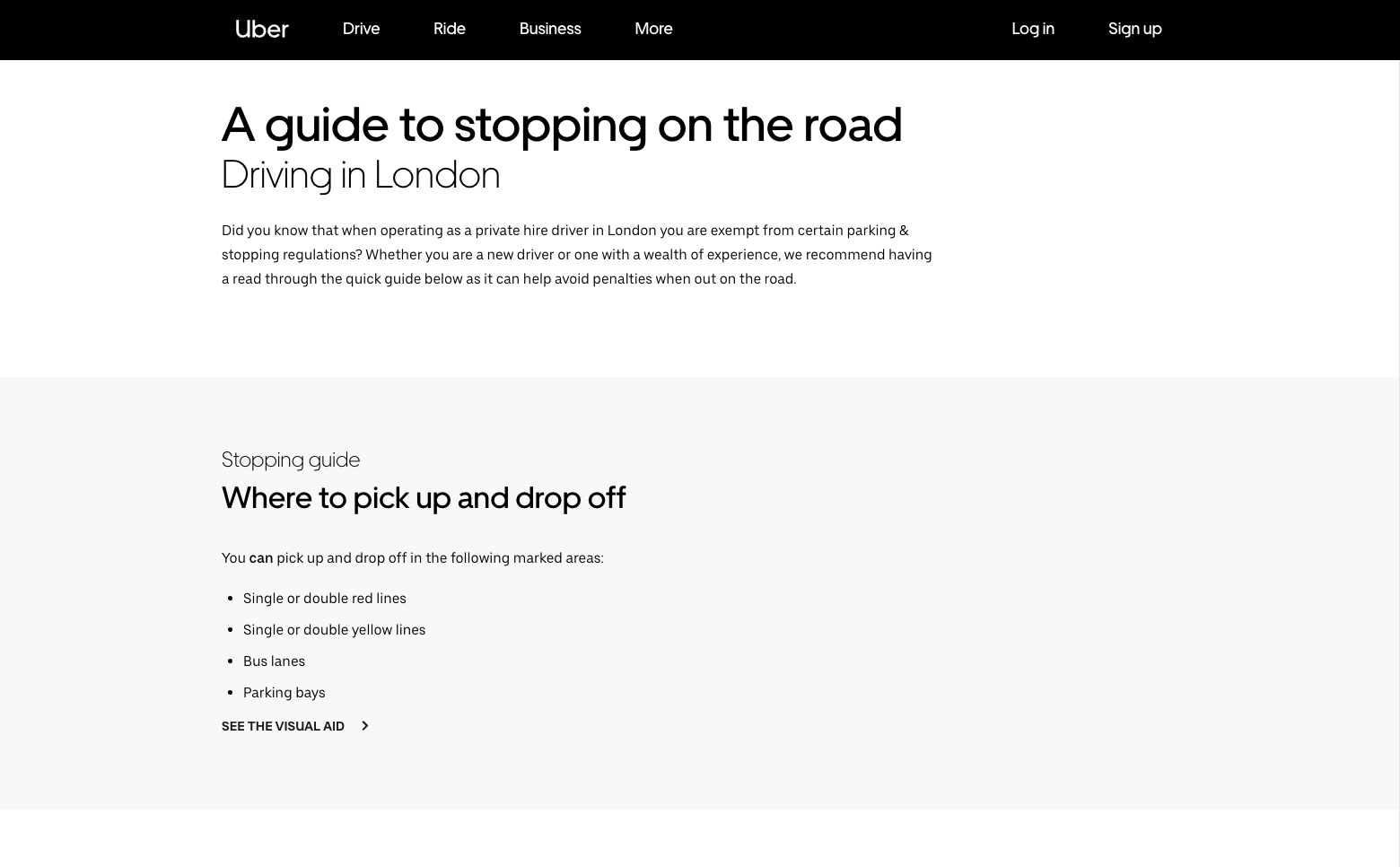
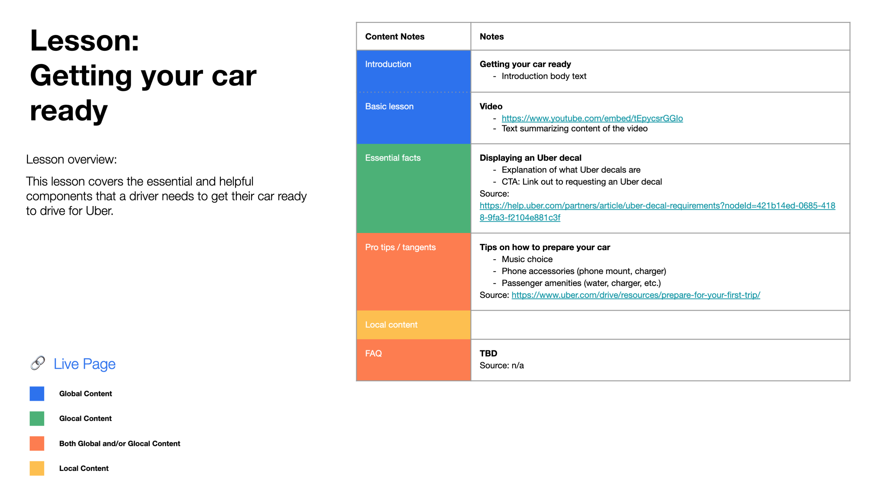
Because of my heavy involvement in the creation of the priority guides, I became extremely familiar with Uber’s partner educational content. Having developed this expertise, I served as one of the main content resources to the UI designers and copywriters as they iterated on the design and copy of all 31 lessons. Here is an example of one of these lessons:
COMPARING THE TWO VERSIONS
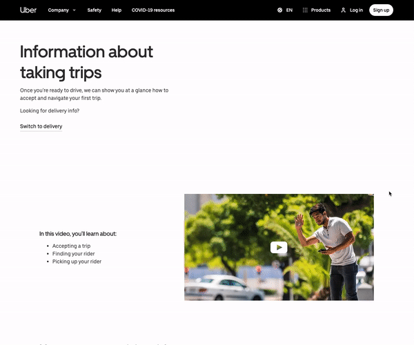
Old version
Only the global video was available in each lesson.
Redesigned version
Additional information was added beneath the global video to ensure that all partners are able to access all the information they need in one place.
REFLECTION
This was my first of many projects with Uber as a UX designer for HAUS. It was challenging, difficult, and complex. Because of the global scope of this project, there was a lot of regional pushback, and it was important to identify which concerns were worth addressing and which ones were not.
On a more human level, I simply enjoyed this project. Of all of the projects I have had the opportunity to work on for Uber, this project is still one of my favorites. There’s simply something nice about creating order and simplicity where there previously was none.